This project is an exploration of headlines frequency, it’s popularity.
The dataset is a collection of headlines from HackerNews portal gathered for period 2006-2015.
Note: to see final result scroll to the end
Let’s dive into exploration of the so-called metaparameters, and find out:
- How popularity correlates with headline length?
- What about popularity in respect quarter periods?
- How does overall popularity changes over time on the website?
- What are the buzzphrases appeared in the headlines and how do they change over time?
Intuitively we can tell “Why these particular articles were popular” - that most probably depends on the content, relevance, the author. Yet, lets look for some unobvious correlations and then visualize most popular headlines!
Dataset
The dataset was compiled by Arnaud Drizard using the Hacker News API, and can be found here. The file contains 1553934 entries, is 171M big (uncompressed) and uses the following column titles:
id, created_at, created_at_i, author, points, url_hostname, num_comments, title
For the sake of this mission only 4 columns are chosen and renamed appropriately:
submission_time– when the story was submitted.upvotes– number of upvotes the submission got.url– the base domain of the submission.headline– the headline of the submission. Users can edit this, and it doesn’t have to match the headline of the original article.
Read-in, Preprocess
Read in the data and preprocess for text mining
import pandas as pd

df = pd.read_csv('stories.csv')
df.columns=['id', 'submission_time', 'posix_time', 'author', 'upvotes', 'url', 'comments_num', 'headline']
df = df[['submission_time', 'upvotes', 'url', 'headline']]
df.head(3)
Ok, we can see what is the data about.
Here is info on the dataframe.
df.info()
<class 'pandas.core.frame.DataFrame'>
RangeIndex: 1553933 entries, 0 to 1553932
Data columns (total 4 columns):
submission_time    1553933 non-null object
upvotes            1553933 non-null int64
url                1459198 non-null object
headline           1550599 non-null object
dtypes: int64(1), object(3)
memory usage: 47.4+ MB
It is rather large, 1.5M entries, which makes it interesting to explore.
Now, comb it with dropna(), so that we have a nice dataset. We can allow such luxury, since dataset is rich and filling nulls would not benefit much in this case.
df.dropna(inplace=True)
len(df)
1455871
Somewhat hundred thousands records have been removed, which is ok.
Core preprocessing
For further processing nltk library would be essential, it is especially appreciated for larger datasets analysis.
Steps would be:
- lowercasing
- concatenate all words from the headlines column
- tokenize
- stripping of punctuation symbols
- get rid of ‘stopwords’
- lemmatize
import nltk

def preprocess_headline(headline):
    headline = headline.lower()

    # tokenize (smart split)
    tokens = nltk.word_tokenize(headline)

    # Stripping of punctuation symbols:
    words_tokenized_nopunct = [w for w in tokens if w.isalpha()]

    # Clean of stopwords. Note transformation to set, rather than using a list. Supposedly gives performance boost.
    stopwords = set(nltk.corpus.stopwords.words('english'))
    words_except_stop = [w for w in words_tokenized_nopunct if w not in stopwords]

    # Lemmatize (smart-stemming of the words)
    WNlemma = nltk.WordNetLemmatizer()
    words_lemmatized = [WNlemma.lemmatize(t) for t in words_except_stop]

    # Gather back into a single phrase-string
    preprocessed_headline = ' '.join(words_lemmatized)
    #preprocessed_headline = ' '.join(words_tokenized_nopunct)
    #print(preprocessed_headline)

    return preprocessed_headline
At this point, creating a copy of the original dataset would be a good decision. So that we continue transofmation with the copy!
dataset_df = df.copy()
And now applying preprocessing of the headlines.
dataset_df['processed_headline'] = dataset_df['headline'].apply(preprocess_headline)
The processing might take a few minutes to transform 1.5M records. By the end we get nice and processed headlines a new column.
dataset_df.head()
Great, so far we have phrases consisting of normalized words: all of them lowercased, having same form and with no punctuation. That way we can work with the column further and count similar phrases!
Great, now we can get so called noun phrases from the headlines. Noun phrases are better much better for our exploration thatn just words, because for example ‘steve jobs’ is a noun phrase occur in headline, whereas if we aimed for just words, we would get only ‘steve’ or only ‘jobs’ to count.
So, let’s derive noun phrases and put them all in one huge list!
from textblob import TextBlob
noun_phrase_list = [ list(TextBlob(processed_headline).noun_phrases) for processed_headline in dataset_df['processed_headline'] ]
noun_phrase_list[:3]
[['business advice'], ['note superfish'], []]
We now have list of lists, let’s flatten it.
noun_phrase_flat = [ item for sublist in noun_phrase_list for item in sublist ]
noun_phrase_flat[:3]
['business advice',
 'note superfish',
 'php uk conference diversity scholarship programme']
Looks great!
A powerful technique is to put the list into collection! A collection is basically a dictionary with a bunch of methods. For example it allows easily acess such method as Counter!
from collections import Counter
counter_collection = Counter(noun_phrase_flat)
counter_collection.most_common(20)
[('show hn', 8360),
 ('open source', 2021),
 ('social medium', 1691),
 ('social network', 1354),
 ('steve job', 1296),
 ('big data', 1204),
 ('silicon valley', 951),
 ('small business', 686),
 ('new york', 658),
 ('combinator bookmarklet', 656),
 ('mobile apps', 533),
 ('google glass', 533),
 ('mobile phone', 416),
 ('google chrome', 408),
 ('mobile app', 400),
 ('hacker news', 391),
 ('new way', 388),
 ('bill gate', 366),
 ('app store', 363),
 ('search engine', 343)]
Cool! However, we can see that topmost phrase is ‘show hn’ which stands for ‘show hacker news’. Thinking of this phrase, it most probably was some kind of a button (header) for showing hacker news, we don’t really need it. Cleaning it out.
phrases_top_20 = counter_collection.most_common(21)[1:]
Get distribution
Let’s visualize distribution of top 20 frequent phrases.
import matplotlib
import matplotlib.pyplot as plt

rslt_dist_df = pd.DataFrame(phrases_top_20, columns=('Phrase','freq')).set_index('Phrase')
matplotlib.style.use('ggplot')
bars = rslt_dist_df.plot.bar(rot=0, figsize=(16,10), width=0.8)
plt.title('Top Frequent Headline buzzPhrases for 10 years in HackerNews')
plt.xticks(rotation=40)
plt.show();
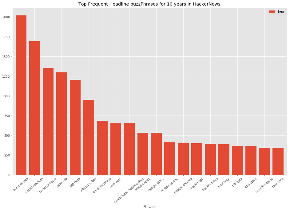
Great! We have a clear picture of buzzphrases in HackerNews headlines over 10 years!
Most frequent domains
Visualize most frequent domains. Some addresses are presented as subdomain.domain.com, which would be converted to domain.com
import re

# Define convert-function subdomain.domain -> domain. We can apply it onto series values.
def unify_domains(value):
        url=str(value)
        subdom_dom_match = re.search('.*\.(\w+\.(?:\w{2,3}||(?!co.uk))$)', url)
        is_gb = re.search('.*\.co\.uk', url)
        if subdom_dom_match and not is_gb:
            url = subdom_dom_match.group(1)
        return url

domain_series = dataset_df['url'].apply(unify_domains)
Get top frequent domains
top_domains = domain_series.value_counts()[:10]
print(top_domains)
blogspot.com       36807
github.com         30312
techcrunch.com     26609
nytimes.com        24125
youtube.com        22029
google.com         16303
wordpress.com      15531
medium.com         12991
arstechnica.com    12336
wired.com          11070
Name: url, dtype: int64
Frequency by hour of the day
Which hours during a day are most prolific to get published.
import dateutil

# Getting submission distribution per hour
def parse_hours(value):
    datetime_val = dateutil.parser.parse(str(value))
    #hour = value.hour
    hour = datetime_val.hour
    return hour

hour_series = dataset_df['submission_time'].apply(parse_hours)
Display publish distribution over hours
hour_dist = hour_series.value_counts()
print(hour_dist[:5])
16    95123
17    94090
15    92098
18    89685
14    85719
Name: submission_time, dtype: int64
dist_sorted = hour_dist.sort_index()
matplotlib.style.use('ggplot')
bars = dist_sorted.plot.bar(rot=0, figsize=(16,10), width=0.8)
plt.title('Publish frequency during day (UTC time) for 2006-2015')
plt.show();
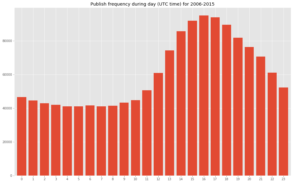
Fair enough, most frequent publishing happened during evenings.
Popularity to Headline length
Is there such correlation?
For that we would nee additional column to present lenght of the headline.
dataset_df['headline_length'] = dataset_df['headline'].apply(len)
dataset_df.head()
Checking Pearsons coefficient
dataset_df.corr()
Coeff less than 0.25 is insignificant, and suggests there is no correlation.
Visualizing a scatterplot, to see the shape and possible clustering.
dataset_df.plot.scatter('headline_length','upvotes',figsize=(16,10))
plt.show();
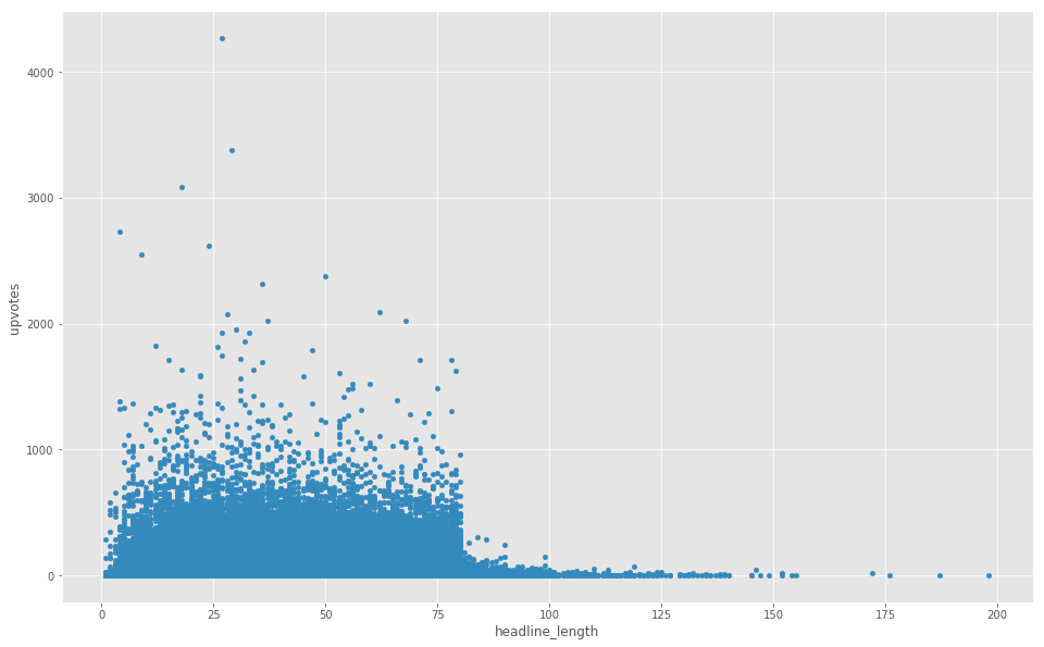
It is very evident that articles with headlines of 80 characters and more are unpopular (except a few exceptions).
Actually the border is way to salient - a sign of some underlying reason.
Popularity over time
Visualize how overall popularity of articles change over time
import datetime

dataset_df['submission_time'] = pd.to_datetime(dataset_df['submission_time'])
popularity_per_quaters = dataset_df.resample('QS', on='submission_time').sum()['upvotes']
popularity_per_quaters.plot(figsize=(16,10))
plt.title('Articles popularity over time')
plt.show();
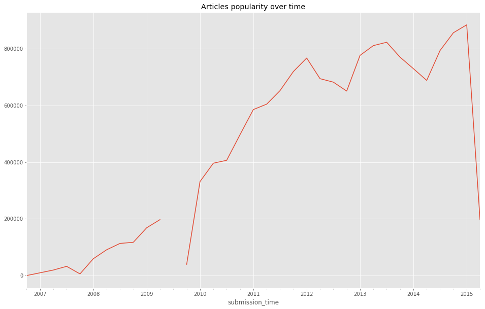
More and more articles got upvoted over time, a good representation of HackerNews growing popularity.
Buzzphrases
That’d be interesting to see Buzzphrases trends over time. Which phrases appear most frequent in headlines over time? Get an insight of what topics were most popular back then and until recently in Hacker community.
First contemplate on the design on how to present it - an exciting step, with so many variations: let imagination flow. The pictures popup and acquire shapes as you think of the graph goals “What would it tell to a reader?”. A good thing is to sketch it with a pencil on a paper.
Details:
I got the design in my mind and a sketch on a paper. The idea is to draw top barplots for each period (quarters or halves-year) through the whole span (2006-2015). On top of it Buzzphrases trends are presented with lines. If you imagine - it is not an easy task to make it visually appealing: too many lines get interwined. Thus an animation would be applied. Initially patches and lines would be gray, not distinguished much. The animation would light-up group of patches and corresponding lines upon mouse hover! Sounds cool. That should work great.
From technical perspective, following steps are to be implemented:
- add dataframe column with corresponding time period
- add dataframe column with month period (that’s because lines would be drawn per month to make them smooth)
- get top Buzzphrases and aggregated frequency for each period. Agg frequency would be presented per month.
- get top Buzzphrases frequencies per months
- Plot bars - a bar for a period, a mean of top Buzzphrases.
- Plot lines - for each top Buzzphrases presented.
- Apply animation to highlight group of patches for a certain period with related buzzphrase-trend-lines
- add annotations to display actual phrases
- add annotations for interesting points
- Focus on colors-palette and make it visually appealing:
- initially bars and lines would be greay and thin
- upon hover (or click?) certain period would be highlighted with the buzzphrase lines thickened and highlighted across all periods!
Each step has it’s technical caveats. We have a design and a plan, and can start making it real.
Add periods
Create indecies: quarter_periods, month_periods. For further sampling per quarter/month.
# Making a copy for manipulations
df_buzz = dataset_df.copy()

# resetting an index, to save orig_index numbers, just in case it might be useful
df_buzz.reset_index(inplace=True)
df_buzz.rename(columns={'index':'orig_index'}, inplace=True)

# Create quarter periods.
# To achieve it: create a copy of time column, then set it as index,
# and then convert this index to quarters via to_period attribute.
df_buzz['submission_time_ind'] = df_buzz['submission_time']
df_buzz.set_index('submission_time_ind', inplace=True)
df_buzz = df_buzz.to_period('Q', copy=True)
# then we reset index, and rename the column to what it presents: quarter_periods
df_buzz.reset_index(inplace=True)
df_buzz.rename(columns={'submission_time_ind':'quarter_periods'}, inplace=True)

# Create month periods.
# To achieve it: create a copy of time column, then set it as index,
# and then convert this index to month via to_period attribute.
df_buzz['submission_time_ind'] = df_buzz['submission_time']
df_buzz.set_index('submission_time_ind', inplace=True)
df_buzz = df_buzz.to_period('M', copy=True)
# then we reset index, and rename the column to what it presents: month
df_buzz.reset_index(inplace=True)
df_buzz.rename(columns={'submission_time_ind':'month_periods'}, inplace=True)

# Setting a multiindex of quarters and months
df_buzz.set_index(['quarter_periods', 'month_periods'], inplace=True)
df_buzz.head()
Looks good. Creating a multiindex involved a number of manipulations, and takes some computational power for 1.5M dataset.
get period lists
The next step is to create datasets of top Buzzphrases per quarter and month periods, suitable for plotting.
# here a copy of dataset is created to perform manipulations
df_buzz_reind = df_buzz.copy()
#df_buzz_reind.reset_index(inplace=True)
df_buzz_reind.sort_values('submission_time', inplace=True)
df_buzz_reind.head()
Pick period to explore between 2010 and 2015 years
df_buzz_reind = df_buzz_reind[(df_buzz_reind['submission_time']>'2010-01-01') & (df_buzz_reind['submission_time']<'2015-01-01')]
Getting nice lists of quarter periods and months periods
Quarter periods
First getting quarter periods lists.
quarters = list(set(df_buzz_reind.index.get_level_values('quarter_periods')))
quarters_series = pd.Series(quarters)
quarters_series_sorted = quarters_series.sort_values()
Get quarter period list and quarter period names list - all sorted in ascending order.
quarter_periods_list = list(quarters_series_sorted)
quarter_names_list = quarters_series_sorted.astype(str).tolist()
quarter_periods_list[:5]
[Period('2010Q1', 'Q-DEC'),
 Period('2010Q2', 'Q-DEC'),
 Period('2010Q3', 'Q-DEC'),
 Period('2010Q4', 'Q-DEC'),
 Period('2011Q1', 'Q-DEC')]
quarter_names_list[:5]
['2010Q1',
 '2010Q2',
 '2010Q3',
 '2010Q4',
 '2011Q1',
 '2011Q2',
 '2011Q3',
 '2011Q4',
 '2012Q1',
 '2012Q2',
 '2012Q3',
 '2012Q4',
 '2013Q1',
 '2013Q2',
 '2013Q3',
 '2013Q4',
 '2014Q1',
 '2014Q2',
 '2014Q3',
 '2014Q4']
quarters_list=list(zip(quarter_periods_list,quarter_names_list))
quarters_list[:5]
[(Period('2010Q1', 'Q-DEC'), '2010Q1'),
 (Period('2010Q2', 'Q-DEC'), '2010Q2'),
 (Period('2010Q3', 'Q-DEC'), '2010Q3'),
 (Period('2010Q4', 'Q-DEC'), '2010Q4'),
 (Period('2011Q1', 'Q-DEC'), '2011Q1')]
Good, we now have our lists!
quarter_periods_listquarter_names_list
And versions zipped to list of tuples (period, period_name): quarters_list
get most frequent buzzphrases for each period
We are building a dictionary of { period_name : top 3 frequent phrases with frequency }. It involves sampling the dataframe for each period and extract words with their frequencies.
Erlier in this project we’ve already extracted top most buzzphrases across all 10 year span! So let’s gather those steps in a single nice function, that would apply for each period and build the dict.
Define a function that exctracts and returns top frequent phrases.
def get_top_freq_phrases(processed_headlines_series):
    # Getting noun phrase list
    noun_phrase_list = [ list(TextBlob(processed_headline).noun_phrases) for processed_headline in processed_headlines_series ]
    # Flattening the list
    noun_phrase_flat = [ item for sublist in noun_phrase_list for item in sublist ]
    # Converting a list to a collection
    counter_collection = Counter(noun_phrase_flat)
    # Remove 'show hn' phrase as unnecessary for the stats
    del counter_collection['show hn']
    # Finally obtain tuples of top 3 common phrases
    collection_for_period = counter_collection
    top_phrases = counter_collection.most_common(5)
    # print(top_phrases)

    return top_phrases, collection_for_period # return top frequent phrases and a collection
We can now go through different periods in dataframe and build a dictionary of top frequent phrases per period.
quarters_top_phrases_dict = {}
for period, period_name in quarters_list:
    df_period = df_buzz_reind.loc[period]
    print(period_name)
    top_phrases, collection_for_period = get_top_freq_phrases(df_period['processed_headline'])
    #print(top_phrases)
    #print(type(collection_for_period))

    quarters_top_phrases_dict[period_name] = [top_phrases, collection_for_period]
2010Q1
2010Q2
2010Q3
2010Q4
2011Q1
2011Q2
2011Q3
2011Q4
2012Q1
2012Q2
2012Q3
2012Q4
2013Q1
2013Q2
2013Q3
2013Q4
2014Q1
2014Q2
2014Q3
2014Q4
Perfect, a dictionary with top phrases and frequencies for each quarter is gathered.
Now we would get a one nice list of all top phrases encountered. As that would allow to build line graphs for each.
top_phrases_uniq = list(set([phrase_freq[0] for sublist in quarters_top_phrases_dict.values() for phrase_freq in sublist[0]]))
top_phrases_uniq
['steve job',
 'world news',
 'triunfo del amor capitulo',
 'google glass',
 'angry bird',
 'combinator bookmarklet',
 'open source',
 'ipad mini',
 'google instant',
 'google buzz',
 'mobile app',
 'new ipad',
 'flappy bird',
 'social network',
 'artificial intelligence',
 'social medium',
 'google nexus',
 'website need',
 'real estate',
 'big data',
 'silicon valley',
 'window phone',
 'aaron swartz',
 'net neutrality',
 'reina del sur capitulo',
 'elon musk']
Perfect!
Now, let’s obtain list frequencies for each phrase! Each list would be used as series data to plot a line.
phrase_series_dict = {}
for phrase in top_phrases_uniq:
    phrase_series_dict[phrase]=[ quarters_top_phrases_dict[period_name][1][phrase] if phrase in quarters_top_phrases_dict[period_name][1] else 'null' for period_name in quarter_names_list]
Now, for the convinience, let’s print our value series for each phrase!
for phrase in top_phrases_uniq:
    print(phrase, phrase_series_dict[phrase])
steve job [18, 78, 32, 39, 70, 37, 93, 396, 56, 49, 39, 49, 32, 29, 39, 30, 38, 20, 8, 17]
world news ['null', 'null', 'null', 'null', 1, 1, 5, 81, 47, 7, 'null', 'null', 'null', 1, 'null', 'null', 1, 'null', 'null', 'null']
triunfo del amor capitulo ['null', 'null', 'null', 1, 9, 73, 'null', 'null', 'null', 1, 'null', 'null', 'null', 'null', 'null', 'null', 'null', 'null', 'null', 'null']
google glass ['null', 'null', 'null', 'null', 'null', 'null', 'null', 1, 5, 17, 14, 7, 95, 125, 57, 55, 43, 64, 17, 16]
angry bird ['null', 1, 4, 14, 45, 25, 15, 18, 20, 6, 11, 1, 3, 5, 2, 4, 5, 3, 'null', 2]
combinator bookmarklet [4, 5, 2, 9, 23, 40, 61, 37, 33, 42, 72, 66, 86, 62, 65, 26, 4, 5, 3, 1]
open source [68, 51, 58, 64, 55, 58, 61, 71, 94, 89, 109, 81, 90, 103, 94, 112, 106, 104, 82, 110]
ipad mini ['null', 'null', 'null', 'null', 'null', 'null', 'null', 2, 4, 4, 13, 53, 7, 4, 1, 2, 'null', 'null', 'null', 3]
google instant ['null', 'null', 32, 13, 4, 'null', 'null', 1, 2, 1, 'null', 'null', 'null', 'null', 'null', 'null', 'null', 'null', 'null', 'null']
google buzz [51, 2, 'null', 'null', 'null', 'null', 'null', 3, 'null', 'null', 'null', 'null', 'null', 1, 1, 'null', 'null', 'null', 'null', 'null']
mobile app [3, 3, 4, 8, 8, 6, 15, 12, 14, 22, 23, 26, 35, 26, 24, 36, 33, 12, 39, 24]
new ipad ['null', 1, 1, 'null', 5, 2, 1, 2, 115, 20, 3, 2, 1, 1, 1, 1, 'null', 'null', 1, 'null']
flappy bird ['null', 'null', 'null', 'null', 'null', 'null', 'null', 'null', 'null', 'null', 'null', 'null', 'null', 'null', 'null', 'null', 42, 11, 5, 2]
social network [35, 39, 49, 77, 58, 54, 76, 58, 63, 79, 68, 45, 63, 38, 53, 42, 41, 30, 31, 38]
artificial intelligence [5, 8, 4, 10, 10, 6, 7, 8, 7, 11, 11, 17, 13, 8, 9, 22, 16, 14, 23, 47]
social medium [45, 39, 50, 56, 66, 87, 129, 97, 129, 115, 72, 90, 97, 101, 84, 59, 39, 41, 60, 40]
google nexus [32, 5, 'null', 8, 'null', 5, 3, 2, 'null', 1, 7, 13, 8, 2, 1, 6, 2, 'null', 1, 1]
website need ['null', 28, 1, 'null', 2, 'null', 1, 2, 2, 1, 'null', 2, 'null', 1, 2, 'null', 'null', 'null', 'null', 'null']
real estate [10, 8, 12, 6, 7, 12, 38, 65, 17, 15, 8, 7, 3, 1, 7, 5, 4, 7, 8, 6]
big data [5, 2, 9, 12, 19, 17, 26, 30, 66, 73, 70, 89, 116, 124, 115, 85, 77, 64, 69, 64]
silicon valley [10, 17, 11, 27, 34, 40, 41, 41, 42, 59, 45, 35, 42, 53, 45, 53, 77, 48, 59, 31]
window phone [6, 1, 18, 35, 30, 14, 16, 22, 25, 36, 15, 18, 20, 10, 11, 9, 14, 7, 4, 3]
aaron swartz ['null', 'null', 'null', 1, 'null', 1, 3, 1, 1, 1, 2, 'null', 122, 7, 7, 1, 8, 2, 2, 'null']
net neutrality [6, 13, 14, 12, 4, 7, 1, 4, 2, 5, 2, 'null', 1, 1, 7, 5, 33, 49, 21, 32]
reina del sur capitulo ['null', 'null', 'null', 'null', 3, 66, 'null', 'null', 'null', 'null', 'null', 'null', 'null', 'null', 'null', 'null', 'null', 'null', 'null', 'null']
elon musk ['null', 3, 8, 'null', 2, 2, 2, 6, 2, 6, 10, 16, 24, 22, 36, 22, 8, 32, 16, 42]
Great! We now have that shows top phrases and their frequencies per quarter periods!
Visualize the graph
Since we gathered the freq data, time to plot the graph.
That is quite a challenge: how to represent those serial data in a nice way. Keeping in mind following aims:
- Display topmost headlines
- Display tendency for each headline throughout 5 years?
Well, how about that would be nice curved lines, each highlighted when hovered over. Adding some icons and annotations would be great as well.
After spending hours of research and trial, I found great solution: Highcharts.com!
Highcharts are absolutely great, smooth and stylish, with so many capabilities! I found it so much more better than plotly or bokeh.
The only thing is that it is javascript-based. I’ve copy-pasted the data-series by hand and then crafted the chart in jsfiddle.net. You can check working code here.
Steve Jobs’ heritage is by far most popular. Aaron Swartz is a very interesting figure I’ve mined from this project and got acquinted with. A very sad story - a genius young man commited suicide on 2013q1 under heavy burden that happened to him. Google Glass and Big Data had a popularity peak somewhere in the middle of 2013, but then declined. Remember Those Flappy birds? That was fun. Also we can see the popularity of Elon Musk and Artificial intelligence coincidentally and unstoppably rising…
Ok, that was interesting to peek into those patterns. And moreover to explore instruments for such endeavors.
All the best :)