My NYC Schools Exploration project completed with interesting results and great visual. There is quite a number of code lines I’ve produced, all for the sake of finding out on how good can matplotlib be in drawing visuals. Turns out it is quite capable!
Scroll to the very bottom to marvel on data-mined results wrapped up in a nice visual!
This research addresses following questions:
- Determing wheter there’s a correlation between class size and SAT scores
- Figuring out which neighborhoods have the best schools
-
In combination with a dataset containing property values for NY districts, we could find the least expensive neighborhoods that have good schools.
-
- Investigating the differences between parent, teacher, and student responses to surveys.
- Assigning scores to schools based on sat_score and other attributes.
View the full code and all artifacts on nbviewer.
For readability means this blog post contains only Findings.
Findings
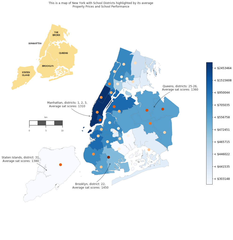
Manhattan is by far the most expensive Borough in NYC in terms of apartment price, while schools SAT scores may be decent, but not so impressive.
Now, the main question: which School Districts are not so expensive to live in NYC and have decent schools according to the SAT score?
- Brooklyn is by far the best according to the map. Apartments are ranging on a lower price spectrum, and SAT score is the highest.
- Staten Island seems to be a ‘School haven’! With least estate prices, the Schools in Staten Island hit the upper SAT score level!
- Some Districts in Queens Borough are a fairly good choice. With apartments price OK, and schools with nice performance.
Additionally: There is no evident enough correlation between how expensive the District is and School Performance.
Wrap up
Thanks for checking out this article!
Additionally I wan’t to highlight, that averages for SAT scores and Property Values were calculated using trim_mean. Which is a good way to ensure no skewing happens due to extra low/high outliers (trim mean basically trims 10% lowest and highest values).
It was more of an exploration of matplotlib, basemap capabilities and those shapefiles. I think the result is quite nice, though there is so much room for improvement.
It is absolutely true, that such graphs are better to be built automatically with other libraries or even online tools! Which would be much faster and even provide interactivity.
Sources:
- http://brandonrose.org/pythonmap (thanks!)
- http://sensitivecities.com/so-youd-like-to-make-a-map-using-python-EN.html#.Wb-9Z8gjFaR
- http://shallowsky.com/blog/programming/plotting-election-data-basemap.html
- https://data.cityofnewyork.us/Education/School-Districts/r8nu-ymqj/data