Basemap is a powerful yet simple tool for python and allows to plot visualizations geography-wise by providing coordinates.
This quick tutorial is a good example of syntax usage and technique references of drawing a basemap via Mercator projection. To achieve that we require coordinates such as Latitude and Longitude.
A high level review of a basemap library.
First instantiate a basemap object. Basemap constructor has following attributes:
- projection: the map projection.
- llcrnrlat: latitude of lower left hand corner of the desired map domain
- urcrnrlat: latitude of upper right hand corner of the desired map domain
- llcrnrlon: longitude of lower left hand corner of the desired map domain
- urcrnrlon: longitude of upper right hand corner of the desired map domain
Ensure to convert spherical cordinates (if it is the case) to Cartesian. Then pass coordinates along with additional parameters to the basemap.scatter() method to map data!
import matplotlib.pyplot as plt
from mpl_toolkits.basemap import Basemap
import pandas as pd
# Read in the data
airlines = pd.read_csv('data/basemap/airlines.csv')
airports = pd.read_csv('data/basemap/airports.csv')
routes = pd.read_csv('data/basemap/routes.csv')
longitudes = airports["longitude"].tolist()
latitudes = airports["latitude"].tolist()
def instantiate_basemap():
m = Basemap(projection='merc',llcrnrlat=-80,urcrnrlat=80,llcrnrlon=-180,urcrnrlon=180) # instantiate
x, y = m(longitudes, latitudes) # Convert from spherical to Cartesian coordinates
return m, x, y
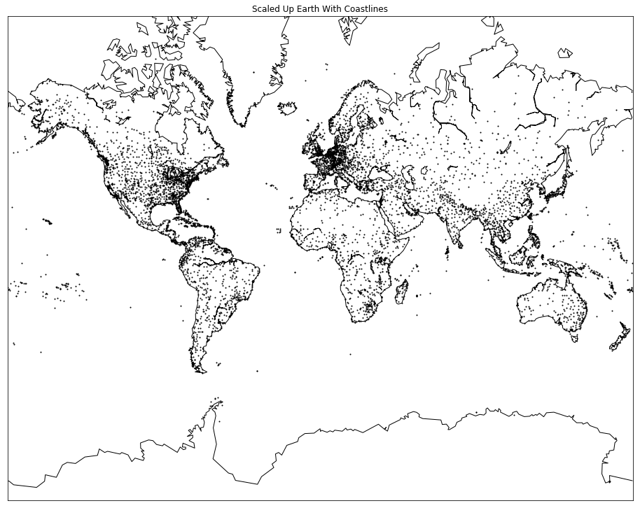
def draw_map():
fig, ax = plt.subplots(figsize=(16,16))
#cb_orange = (255/255, 128/255, 14/255) # Defininf Orange color (got from Tableau)
m.scatter(x, y, s=1, zorder=2, color='black') # Map the data!
m.drawcoastlines() # Draw coastlines
plt.title("Scaled Up Earth With Coastlines")
m, x, y = instantiate_basemap()
draw_map()
plt.show()
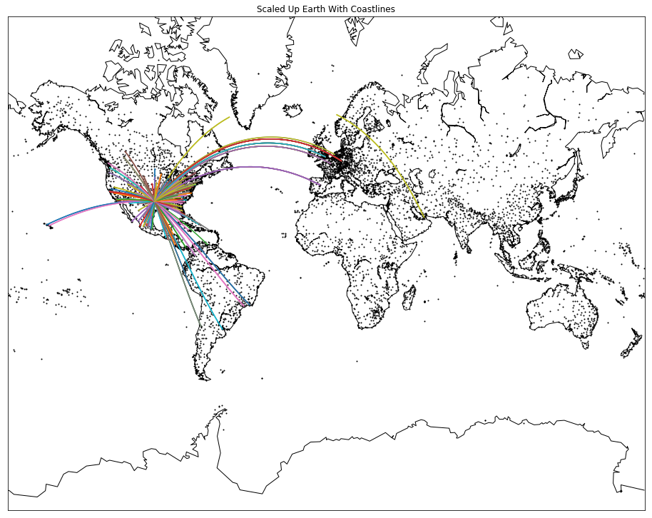
Draw routes via greatcircles
basemap.drawgreatcircle() allows to plot great circles given start and end coordinates.
Unfortunately, basemap struggles to create great circles for routes that have an absolute difference of larger than 180 degrees for either the latitude or longitude values. This is because the basemap.drawgreatcircle() method isn’t able to create great circles properly when they go outside of the map boundaries. This is mentioned briefly in the documentation for the method:
Note: Cannot handle situations in which the great circle intersects the edge of the map projection domain, and then re-enters the domain.
So, we have to offset it by ensuring diff is less than 180.
geo_routes = pd.read_csv("data/basemap/geo_routes.csv")
dfw = geo_routes[geo_routes['source'] == "DFW"]

# Define a function that accepts a dataframe and reads in end, start coordinates to draw the circles
def create_great_circles(df):
    for index, row in df.iterrows():
        end_lat, start_lat = row['end_lat'], row['start_lat']
        end_lon, start_lon = row['end_lon'], row['start_lon']

        if abs(end_lat - start_lat) < 180:
            if abs(end_lon - start_lon) < 180:
                m.drawgreatcircle(start_lon, start_lat, end_lon, end_lat)

m, x, y = instantiate_basemap()
draw_map() # Draw map
create_great_circles(dfw) # Add great circles (routes)
plt.show()
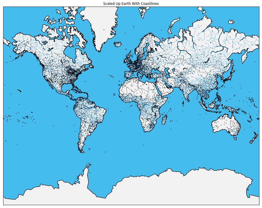
Improve aesthetics
Change style and colors to not only look appealing but to improve perception.
Note: Remember m.scatter() had zorder=2 to ensure data points are placed higher
m, x, y = instantiate_basemap()
draw_map() # Draw initial map

m.drawmapboundary(fill_color='#46bcec') # Make your map into any style you like
m.fillcontinents(color='#f2f2f2',lake_color='#46bcec') # Make your map into any style you like
m.drawcoastlines()
m.drawrivers(color='#0089E0') # Default colour is black but it can be customized
m.drawcountries()

plt.show()
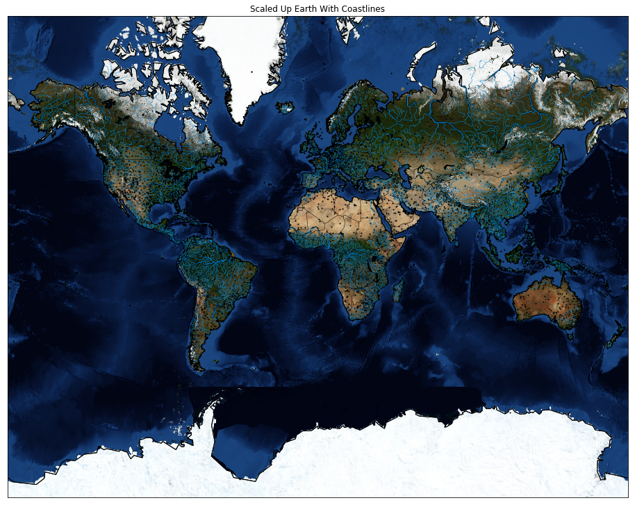
NASA Marble and other backgrounds
Basemap provides various background styles. It essentially places a background image instead of a map and plots on top of it.
Here is an example with NASA blue marble
m, x, y = instantiate_basemap()
draw_map() # Draw initial map

#m.drawmapboundary(fill_color='#46bcec') # Make your map into any style you like
#m.fillcontinents(color='#f2f2f2',lake_color='#46bcec') # Make your map into any style you like
m.drawcoastlines()
m.drawrivers(color='#0089E0') # Default colour is black but it can be customized
m.drawcountries()

m.bluemarble()

plt.show()
Other style examples
m.shadedrelief()
m.nightshade(datetime.datetime.now()) # shades according to your local time
m.etopo()
Conclusion
Python Basemap as the name suggests is indeed very base, yet a very good visualization instrument.
Keep exploring data mapping. Here are some suggestions on plotting geographical data: Creating 3D plots using Plotly Creating interactive visualizations using bokeh Creating interactive map visualizations using folium
Good Luck and have fruitful time!